When was the last time you gave your website design a shake up? Website designs should be dynamic; changing with technology, trends and navigational improvements. If you aren’t going with the flow, you’re losing clients. Here are some common design mistakes that are killing your conversion rate.
Let’s start at the very beginning
If you have elaborate login procedures that require potential customers to create an account, provide wads of information or sign over their first born before you allow them access, then stop that. Let’s face it; if I have to create an account or go back to my email to complete the login, I’m heading over to Amazon or eBay faster than you can say; “Bounce rate!” You need to make your site and shop as accessible as possible, asking only for the information you absolutely need to proceed. Asking clients to set up an account is kind of like trying to skip the dinner on a first date; most people need to establish trust before they are willing to spend the time and effort it takes to set up an account.
Seamless navigation
Ensure that your website has a flow and that this makes navigation as simple as possible. Visitors to your website should know exactly where they are and where they should go next. The architecture of your website is essential to its success as people won’t stick around if they get lost. Ensure that your navigation is just as simple no matter what device visitors use to access it. Make your site mobile-friendly so that people can move around easily whether they are on a tablet, smart phone or laptop.
Clear call to action
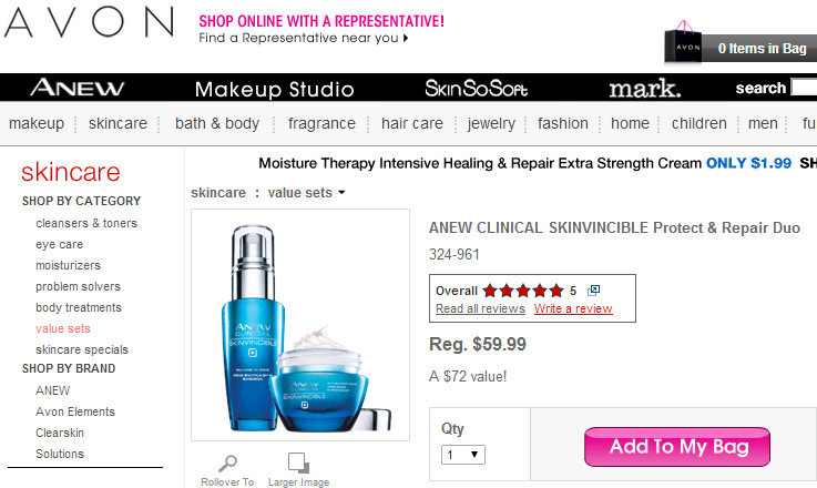
You want to make it as easy as possible for your visitors to hit the ‘Add to Cart’ button, so make it big, juicy and irresistible. This also goes for your newsletter subscriptions and social media buttons. You want people to purchase your products, sign up to your newsletter and share your content, so make sure these buttons are on every page and really easy to see. Take a look at this great example from Avon with their shiny pink ‘add to bag’ button.
A picture’s worth a thousand words
You need to have several pictures of your product from different angles so that your client knows exactly what they are getting. If your product comes in different colours, put the pictures next to each other to facilitate comparison. If you need to, show perspective too i.e. if you are selling a diamond ring, use a hand model to show how big it is.
Live chat improves conversions
Consider using live chat programs so that your clients always have an easy, direct line to your customer care representatives. This will mean that they get a message when they are on the site that someone is standing by to help them. If they can get answers to questions without having to navigate through the site, they are far more likely to buy.
Customer reviews
One issue that all online business struggle with is trust. You are asking a client to hand over their hard-earned cash without having seen your product. A recommendation from another customer is a greater testimony than your own assertions that your product is awesome.


